The Silent Storyteller of Your Firm
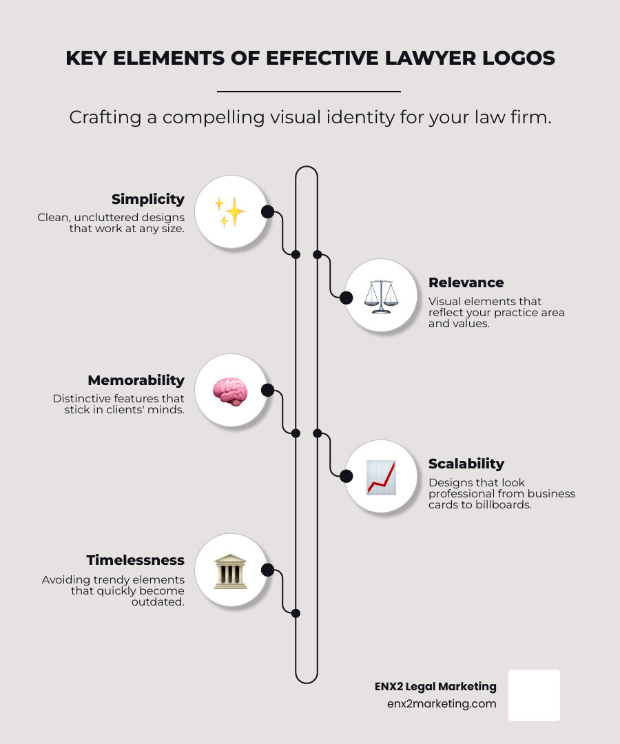
Your lawyer logo is the visual cornerstone of your firm’s identity. It’s often a potential client’s first impression—a silent storyteller broadcasting your expertise and values in seconds. An effective logo is built on five key elements:
- Simplicity – Clean, uncluttered designs that are easy to recognize.
- Relevance – Visuals that reflect your practice area and firm values.
- Memorability – Distinctive features that stick in a client’s mind.
- Scalability – A design that looks professional on everything from business cards to billboards.
- Timelessness – An approach that avoids trends that will quickly look dated.
The power of branding is clear: research shows that consistent brand presentation could increase your law firm’s revenue by 23%. The legal industry already leverages this, with 45% of large firms using blue in their logos to convey trust and stability, proving the strategic importance of a thoughtful visual identity.
Modern logos have moved beyond clichéd gavels and scales. Today’s most successful designs balance authority with approachability, using strategic color, typography, and symbolism to stand out.
I’m Nicole Farber, CEO of ENX2 Legal Marketing. For over 10 years, I’ve helped firms develop compelling lawyer logos that build client trust. A great logo isn’t just decoration; it’s a strategic asset that communicates your firm’s value 24/7.

The Anatomy of Effective Lawyer Logos
An impactful lawyer logo tells a visual story of your firm’s values and expertise. Before a client reads your bio, your logo has already made a first impression, making effective design essential for success. Every element—from color to font—works together to build that trust.
Choosing Your Visual Language: Color and Typography
The colors and fonts in lawyer logos are powerful psychological tools. Blue is a dominant color in legal branding for a reason. Used by about 45% of top firms, it evokes trust, stability, and reliability. Dark blue, in particular, signals knowledge and integrity.
Other colors also have their place:
- Black conveys power and sophistication.
- Gray offers balance and neutrality, perfect for mediation firms.
- Burgundy suggests established tradition.
- Green can signal growth or an environmental focus.
A common mistake is using too many colors. Stick to a maximum of 2-3 for clarity and versatility. We also advise against bright, jarring colors like neons, which can create a sense of anxiety. For deeper insights, our guide on using color to define your brand is a great resource, and the team at InVision offers excellent insights into color theory.
Typography is another key storyteller. Serif fonts (e.g., Times New Roman) have small decorative strokes that communicate tradition and authority. In contrast, sans-serif fonts (e.g., Helvetica) offer a clean, modern appeal, suggesting innovation and approachability. Legibility is paramount, so choose web-safe fonts like Arial or Verdana that display consistently across all devices.
| Feature | Serif Fonts | Sans-Serif Fonts |
|---|---|---|
| Aesthetic | Traditional, classic, formal | Modern, clean, minimalist |
| Conveys | Trust, authority, reliability, history | Approachability, innovation, tech-savviness |
| Use Case | Established firms, corporate law, litigation | Contemporary firms, tech law, family law, online |
| Legibility | Excellent in print, can be less clear on screen | Excellent on screen, highly versatile |
Beyond the Gavel: Using Symbols, Shapes, and Simplicity
It’s time to move beyond overused legal clichés like gavels, scales, and columns. While recognizable, they fail to differentiate your firm in a crowded market.

Modern branding favors abstraction and geometric precision. Clean lines, simple shapes, and strategic use of negative space project professionalism and efficiency. Abstract symbols can be powerful; for example, interlocking shapes might suggest partnership, while an upward arrow could represent successful advocacy. Initial-based monograms also offer a sophisticated, simple alternative, but require careful design to ensure they are unique.
Simplicity is strategic. A simple logo is more memorable, versatile, and scalable, working effectively from a business card to a billboard. It should capture your firm’s identity in a split second. When we incorporate legal symbols, we focus on subtle, unique interpretations that resonate with a specific practice area while avoiding generic imagery. Our insights on graphic design explore these concepts in greater detail.
Essential Best Practices for Modern Lawyer Logos
A single logo design is not enough. To maintain brand consistency, you need a family of logo variations for different applications:
- Wordmark: Your firm’s name in distinctive typography.
- Lettermark/Monogram: Ideal for small spaces like social media profiles.
- Combination Mark: A pairing of a symbol and wordmark, often the primary logo.
- Favicon: The tiny icon in browser tabs, crucial for website recognition.
Using the correct file types is critical to avoid a blurry, unprofessional look.
- Vector files (AI, EPS, SVG) are essential. They use mathematical paths, not pixels, allowing them to scale to any size without losing clarity. They are perfect for everything from print to digital.
- Raster files (PNG, JPG) are for screen use. PNGs support transparent backgrounds, while JPGs offer good compression for smaller file sizes.
Understanding where your logo will appear—from letterheads to websites—guides these design and format decisions. For more on this, explore our piece on why your brand needs the best logo ever.
Inspiring Examples of Effective Law Firm Logos
Real-world examples illustrate these principles best:

- Vela Wood: This logo uses a unique, abstract glyph combining the firm’s initials. Its geometric, clean lines create a modern and sophisticated identity without legal clichés.
- Ben Crump Law: This logo leverages bold typography and confident colors to build a strong personal brand, conveying authority and distinction.
- The Ticket Clinic: By using imagery directly related to traffic tickets, this logo instantly communicates the firm’s niche specialization, making it highly relevant and memorable.
- California Innocence Project: The logo uses symbolism to represent breaking through barriers, powerfully communicating the firm’s mission to free the wrongfully convicted.
These examples prove that the most effective lawyer logos are unique, memorable, and clearly communicate the firm’s identity and values through smart design.
Bringing Your Logo to Life: From Concept to Protected Asset
Creating a lawyer logo is about building a strategic business asset. The journey from concept to a legally protected brand mark requires careful planning, smart decisions, and the right creative team.
The Blueprint: Your Lawyer Logos Design Strategy
A successful logo begins with strategy, not a sketch. Before any design software is opened, a comprehensive design brief must be developed. This process starts with deep introspection and market analysis. You must first understand your target audience and analyze your competitors to identify opportunities for differentiation and ensure your brand stands out.
Next, you must define your firm’s unique personality and core values. An aggressive criminal defense firm needs a different visual identity than a compassionate family law practice; your logo must embody these foundational principles. To guide this strategic thinking, consider the following questions:
- Who is your ideal client? Think beyond basic demographics. What are their needs, fears, and expectations when seeking legal help? A logo for a tech startup practice should feel different from one targeting retirees for estate planning.
- What is your firm’s core message? If you could communicate only one thing about your firm, what would it be? Strength? Innovation? Compassion? Reliability? This central theme will be the guiding star for your design.
- How do you differ from your competitors? Research other law firms in your practice area and location. What visual trends do you see? A unique logo avoids blending in and carves out a distinct space in the client’s mind.
- What is your firm’s personality? Are you modern and forward-thinking or traditional and established? Your choice of colors, fonts, and symbols should align with this identity.
While DIY or stock logo options seem budget-friendly, they often result in generic, amateurish designs that fail to connect with clients and cannot be trademarked. Working with a professional designer or agency is the smartest investment. When choosing a creative partner, review their portfolio for legal industry experience and ensure clear communication and contracts are in place. The best logos come from a collaborative partnership where you provide clear strategic goals and constructive feedback. A professional agency like ENX2 Legal Marketing can ensure consistency across your entire brand ecosystem, from your website to business cards. We specialize in graphic design for law firms, creating cohesive identities that work everywhere.
Protecting Your Mark and Building Your Brand
Once your logo is designed, you must protect it. Trademarking is essential armor for your brand in a competitive marketplace. While you gain some common-law rights simply by using your logo, these are limited geographically. For comprehensive coverage, federal registration with the United States Patent and Trademark Office is the gold standard.
Federal registration grants you:
- Exclusive rights to use your logo across the U.S.
- Public proof of ownership, simplifying legal action against infringement.
- The ability to use the ® symbol, a powerful deterrent.
- A foundation for international protection if your firm expands.
The process involves a thorough search and filing with the United States Patent and Trademark Office. Working with an experienced intellectual property attorney is highly recommended to steer this complex process.
At ENX2 Legal Marketing, we know your logo is just the start. Brand consistency across every client touchpoint—from your website to social media—is what transforms a simple logo into a powerful business asset. A professional, protected lawyer logo builds trust, creates recognition, and provides a visual foundation for growth. If you’re ready to lift your firm’s visual identity, we’re here to help you get a professional law firm logo design that works as hard as you do.

