Why Professional Law Firm Logo Design Is Your First Victory in Court
Law firm logo design is the cornerstone of your legal practice’s visual identity and often the first impression potential clients have of your firm. A well-crafted logo doesn’t just look professional—it builds trust, conveys expertise, and can significantly impact your bottom line.
Key Elements of Effective Law Firm Logo Design:
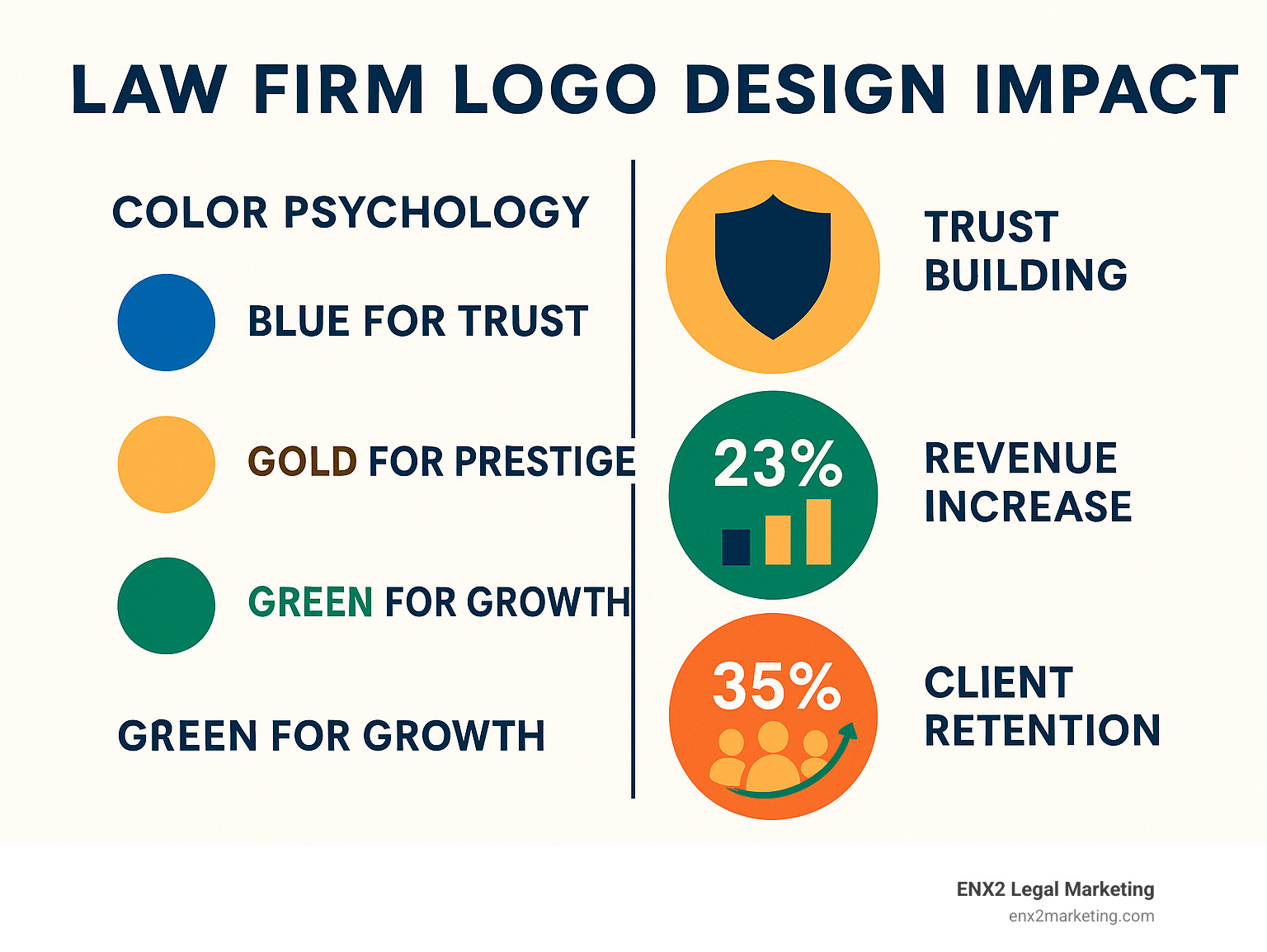
- Color Psychology: Blue for trust (used by 45% of top law firms), gold for prestige, green for growth
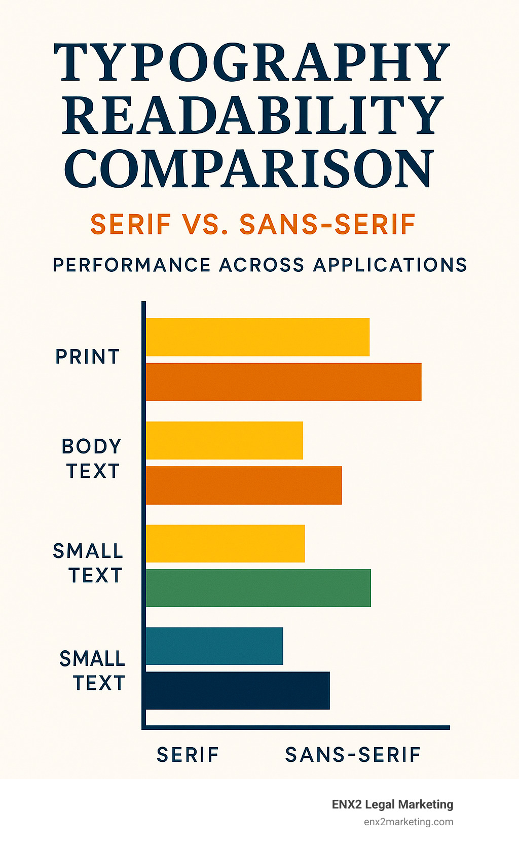
- Typography: Serif fonts for tradition and authority, sans-serif for modern appeal
- Symbols: Scales of justice, columns, shields, or custom icons reflecting your practice area
- Versatility: Scalable designs that work across websites, business cards, and billboards
- File Formats: Vector files (AI, EPS, SVG) and raster formats (PNG, JPG) for all applications
The stakes are higher than you might think. Research shows that consistent brand presentation can increase revenue by 23%, while 33% of law firms have witnessed market share erosion. In a competitive legal landscape where 35% of clients leave firms within the first year, a memorable logo becomes a crucial differentiator.
Whether you’re launching a solo practice or rebranding an established firm, your logo serves as your “silent storyteller”—communicating your values, expertise, and professionalism before you even speak to a potential client.
I’m Nicole Farber, founder of ENX2 Legal Marketing, and I’ve spent over 12 years helping law firms create compelling visual identities that attract clients and build lasting practices. Through my experience in law firm logo design and digital marketing, I’ve seen how the right visual elements can transform a firm’s market presence and client acquisition.
Law firm logo design terms explained:
– law firm email marketing
– law firm local SEO
21 Creative Law Firm Logo Design Ideas for Powerful Law Firm Logo Design

After helping hundreds of law firms develop their visual identities over the past decade, I’ve found that the most successful law firm logo design projects share one common thread: they tell a story that resonates with both the attorneys and their ideal clients.
Think of your logo as your firm’s visual elevator pitch. In the few seconds it takes someone to glance at your business card or website, your logo needs to communicate professionalism, expertise, and trustworthiness.
The most effective legal logos typically fall into four main categories. Wordmarks focus on your firm name with distinctive typography, while monograms create memorable marks from your initials. Pictorial marks use recognizable symbols that connect to legal practice, and abstract marks employ geometric shapes to create unique brand identities.
Simplicity wins every time. The logos that stick in people’s minds are clean, clear, and instantly recognizable whether they appear on a smartphone screen or a highway billboard.
When we work with firms on their law firm logo design, we focus on creating something that feels both professional and memorable. It’s that sweet spot between looking serious enough to handle important legal matters while being approachable enough that potential clients feel comfortable reaching out.
More info about Graphic Design Services
Classic & Trust-Building Law Firm Logo Design Concepts

Classic law firm logo design elements never go out of style—they work. When someone sees columns, shields, or scales of justice, their brain immediately connects these symbols with legal expertise and institutional authority.
Blue dominates the legal landscape for good reason. About 45% of large law firms incorporate various shades of blue in their logos. Blue triggers feelings of trust, reliability, and calm professionalism in viewers. When you pair blue with gold accents, you’re adding a layer of prestige and established success.
Traditional symbols that work beautifully include columns and pillars that represent the foundation of justice, shields that convey protection and defense of client interests, and scales of justice that remain the universal symbol of fairness. Classical typography using serif fonts communicates gravitas and scholarly authority.
Color combinations that consistently perform well include navy blue with gold accents for premium positioning, deep blue with silver for modern professionalism, and burgundy with cream for sophisticated warmth. Black with gold creates luxury and exclusivity.
These classic approaches work particularly well for established firms, corporate law practices, and attorneys who want to project traditional legal authority. The key is executing these familiar elements with enough sophistication to avoid looking generic.
Scientific research on color theory confirms that color choices influence perception within seconds of viewing.
More info about Graphic Design for Law Firm
Modern Minimalist Law Firm Logo Design Trends for Sleek Law Firm Logo Design

The shift toward minimalist law firm logo design reflects how legal practices are evolving to meet modern client expectations. Today’s clients often prefer attorneys who feel approachable and efficient rather than intimidating and overly formal.
Negative space usage has become one of my favorite techniques in modern legal logos. There’s something magical about designs that reveal hidden meanings when you look closer—like a logo that appears to be simple text but contains scales of justice in the spacing between letters.
Sans-serif typography dominates minimalist designs because it projects contemporary professionalism and accessibility. Clean, geometric fonts suggest that your firm communicates clearly and efficiently. Monochrome palettes using black, white, and gray combinations offer maximum versatility across all applications.
The beauty of geometric shapes in minimalist design lies in their perfect scalability. A simple, well-designed mark works equally well on a mobile screen and large office signage.
Minimalist approaches offer superior scalability, reduced printing costs, timeless appeal that won’t look dated in five years, and brand flexibility that adapts easily across various marketing materials.
Successful minimalist techniques include using a single letter as the primary mark, creating custom letterforms with subtle legal references, and employing strategic color blocking for visual impact.
The challenge with minimalist design lies in achieving distinctiveness without complexity. The most successful modern legal logos find that perfect balance between simplicity and memorability.
Scientific research on brand consistency shows that streamlined visual identities perform better across multiple touchpoints.
Symbol-Driven Logos that Tell Your Firm’s Story

Symbol-driven law firm logo design goes beyond generic legal imagery to create meaningful visual narratives that reflect your firm’s unique story and specializations.
Practice area symbols offer powerful storytelling opportunities. Personal injury firms use stylized human figures or protective shields. Family law practices benefit from interlocking rings, family trees, or home symbols. Corporate law firms often use building silhouettes or handshake icons. Environmental law practices naturally gravitate toward leaf motifs or earth symbols.
Geographic connection symbols create powerful local bonds. County or state outlines work beautifully for firms that serve specific regions, while landmark silhouettes establish immediate regional identity.
Values-based symbols communicate your firm’s core principles. Justice can be represented through reimagined scales, while protection comes through shield variations. Growth appears in upward arrows or tree imagery, and stability shows through foundation symbols or pillars.
Creative symbol development techniques include embedding secondary symbols within primary marks and using negative space to reveal additional imagery. Modular systems create symbols that work individually or combined.
The most effective symbolic logos tell stories that resonate with both attorneys and clients. A family law firm might incorporate a tree symbol to represent growth, stability, and branching family connections.
Symbol trademark considerations require careful attention. Ensure originality to avoid infringement issues, research existing legal symbols in your jurisdiction, and consider federal trademark registration for unique marks.
Custom Typography & Color Palettes That Win Cases Visually

Custom typography and strategic color selection in law firm logo design create psychological associations that can make or break first impressions.
Typography psychology plays a fascinating role in legal branding. Serif fonts convey traditional authority and established expertise, suggesting academic credibility and formal professionalism. Sans-serif fonts project modern efficiency and accessible communication, implying innovative problem-solving and contemporary methods.
Advanced typography techniques include custom kerning for optimal readability, font pairing that combines serif and sans-serif elements, and weight variations that use different font weights for visual emphasis.
Color psychology for legal practices involves understanding how different colors affect client perceptions. Blue creates feelings of trust and stability—perfect for corporate law. Green suggests growth and harmony, ideal for environmental and business law. Purple conveys luxury and wisdom, working beautifully for high-end practices. Red projects energy and strength—excellent for litigation work. Gold represents prestige and success, perfect for established firms.
Strategic color application follows the 60-30-10 rule. Your primary color should appear in 60% of applications, your secondary color in 30%, and your neutral color in 10%.
Technical color considerations include RGB values for digital applications, CMYK values for print materials, and Pantone colors for consistent color matching. Accessibility requires sufficient contrast ratios for readability.
Typography and color combinations that consistently work include classic authority with dark blue serif and gold accents, modern professional using charcoal sans-serif with silver highlights, and premium positioning employing black serif with metallic gold details.
The key to successful typography and color selection lies in understanding your target audience’s expectations while finding ways to differentiate your firm within those parameters.
More info about The Art of Graphic Design
Conclusion & Next Steps
Your journey to creating an effective law firm logo design doesn’t end with choosing colors and fonts. The best legal logos tell a story, build trust, and grow with your practice over time. After exploring 21 creative approaches, you now have the foundation to develop a visual identity that truly represents your firm’s unique value.
The magic happens when strategy meets creativity. Your logo needs to work harder than just looking professional—it should instantly communicate your expertise, attract your ideal clients, and differentiate you from every other law firm in your market.
Think beyond the business card. Your logo will live everywhere: your website header, social media profiles, court documents, and even that billboard you might consider someday. The designs that succeed are the ones that look just as compelling on a smartphone screen as they do on letterhead.
Don’t fall in love with trends. That sleek gradient or trendy font might look amazing today, but will it still feel relevant in five years? The most successful law firms choose design elements that age gracefully while still feeling fresh and current.
Your logo is just the beginning. Once you have a strong visual identity, it needs to work seamlessly across your entire marketing ecosystem. Your website design, business cards, email signatures, and office signage should all feel like they belong to the same professional, trustworthy firm.
At ENX2 Legal Marketing, we’ve spent over a decade helping law firms create visual identities that actually work in the real world. From employment law specialists to personal injury practices, we’ve seen how the right law firm logo design can transform how potential clients perceive your expertise and professionalism.
Your next moves are straightforward but important. Start by honestly evaluating your current brand—does it reflect where your firm is today and where you want to go? Define what makes your practice unique, then work with designers who understand the legal industry. Test your concepts with real people, refine based on their feedback, and implement consistently across every touchpoint.
Remember to protect what you create. Trademark research and registration might seem like extra steps, but they’re essential for safeguarding your investment.
The investment in professional logo design pays for itself through improved client perception, stronger referrals, and clearer market positioning. When potential clients make decisions in seconds, your visual identity often determines whether they’ll pick up the phone or keep scrolling.
More info about online legal marketing