Why Justice Scale Logos Remain the Gold Standard for Legal Branding
A justice scale logo represents far more than simple imagery—it’s the visual cornerstone of legal authority and trust. These symbols continue to dominate legal branding for one simple reason: they instantly communicate fairness, balance, and professional credibility.
Key Elements of Effective Justice Scale Logos:
- Balance scales – Core symbol representing fairness and impartiality
- Minimalist designs – Clean, professional appearance for modern firms
- Classic styles – Traditional aesthetics for established practices
- Vector format – Essential for scalability across all media
- Complementary symbols – Often paired with gavels, pillars, or law books
The scales of justice trace back to ancient civilizations, from the Egyptian goddess Ma’at to the Greek goddess Themis. Today’s legal professionals understand that their logo serves as the first impression for potential clients seeking trustworthy representation.
Popular Justice Scale Logo Styles:
- Line art and minimalist interpretations
- Emblem-style designs with traditional elements
- Abstract representations focusing on balance
- 3D rendered modern versions
- Vintage-inspired classical designs
As Nicole Farber, founder of ENX2 Legal Marketing, I’ve helped countless law firms develop powerful justice scale logo designs that capture their unique brand identity while honoring legal tradition. My 12 years of experience in legal marketing has shown that the right logo can be the difference between a firm that blends in and one that commands attention.
Exploring the Styles and Symbolism of the Justice Scale Logo
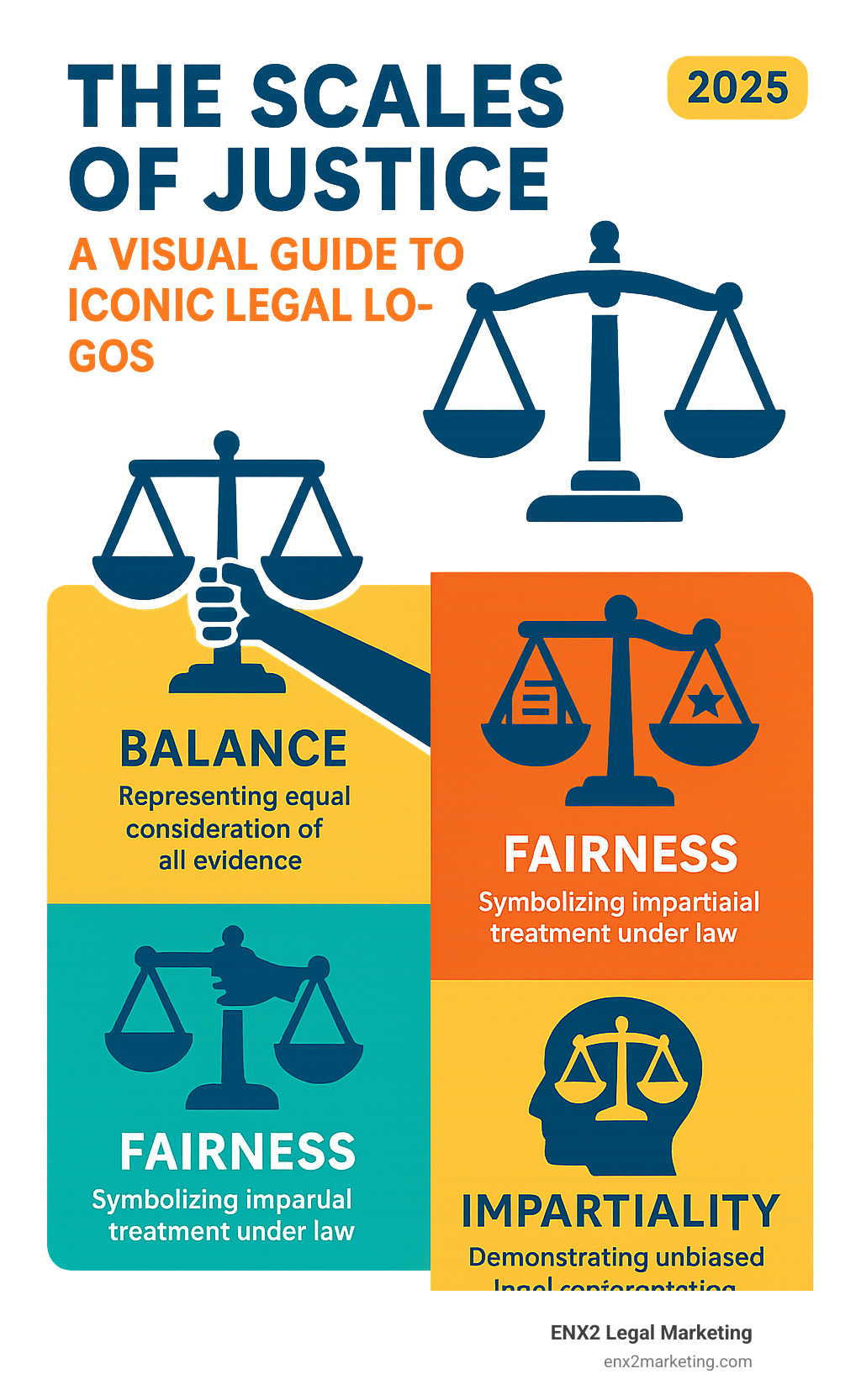
The justice scale logo is one of the most powerful symbols in legal branding, instantly communicating trust, authority, and fairness. Over the centuries, this icon has evolved from ancient carvings to sleek digital designs, adapting to the times while retaining its core message. The beauty of a justice scale logo lies in its versatility. Whether minimalist or ornate, each style tells a story about the firm it represents. Understanding these different approaches—and the rich symbolism behind them—is crucial for creating a meaningful brand identity. For those interested in the principles of visual communication, our guide on The Art of Graphic Design explores how thoughtful design can transform an image into a compelling brand statement.
Decoding the Symbolism: More Than Just Balance
When clients see a justice scale logo, they see a powerful image representing the careful weighing of evidence, the pursuit of truth, and the promise of impartial treatment. The roots of this symbolism stretch to ancient civilizations. In Egypt, the goddess Ma’at used scales to weigh human hearts against a feather of truth. The Greeks honored Themis, goddess of divine law, who carried scales to represent the balance required for true justice.
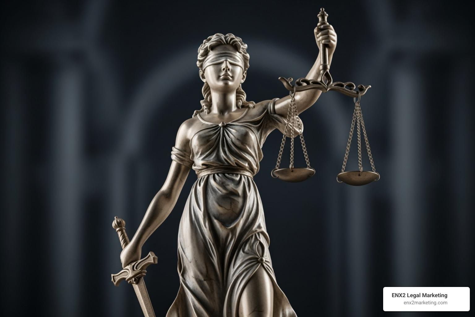
But it’s Lady Justice (or Iustitia, her Roman equivalent) who is most recognizable in modern legal symbolism. As detailed by institutions like the U.S. Department of Justice, she typically stands blindfolded with scales and a sword, embodying a complete philosophy of law. The scales represent the careful weighing of evidence to find the truth. The blindfold embodies impartiality—the promise that justice is applied equally to all, regardless of power, wealth, or influence. The sword symbolizes the power of reason and the enforcement of justice. This rich historical foundation means every justice scale logo carries an instant message of integrity, communicating your commitment to the core principles of the legal system.
Anatomy of a Legal Logo: Elements Beyond the Scales
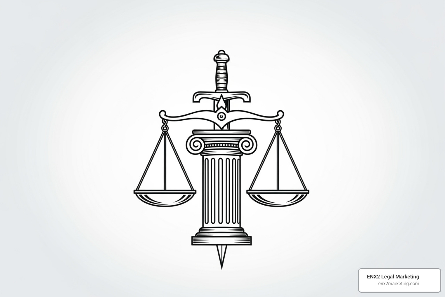
While scales form the heart of a justice scale logo, memorable designs often incorporate additional symbols for greater depth and nuance. Each element tells a part of the story about a firm’s philosophy and approach.
- The Sword: Frequently appearing alongside Lady Justice, the sword is a powerful symbol of enforcement and authority. It is not a weapon of aggression but an instrument of reason and justice. Typically depicted as a double-edged blade, it signifies that justice can rule against either party, and its power must be wielded with precision and care. The sword reinforces the idea that legal decisions are not merely suggestions but have binding power and consequences, offering clients a sense of protection and finality.
- The Gavel: Instantly recognizable, the gavel symbolizes judicial authority and the conclusive nature of the law. Its sharp rap brings order to a courtroom and signifies the finality of a decision. In a logo, it communicates decisiveness and strength, suggesting a firm that is effective and commands respect within the legal system.
- Pillars: From classical Greco-Roman architecture, pillars evoke a sense of stability, tradition, and the enduring strength of the law. They suggest that the firm is built on a solid, unshakeable foundation of legal principles and precedent. For clients, this imagery can be deeply reassuring, implying that the firm is a steadfast institution they can rely on.
- Law Books: This element speaks directly to knowledge, scholarship, and the importance of precedent in the legal field. A logo featuring law books suggests a practice that is well-researched, diligent, and grounded in a deep understanding of legal doctrine. It communicates intellectual rigor and expertise.
- The Laurel Wreath: An ancient symbol of victory and honor, the laurel wreath adds an aspirational quality to a logo. It suggests success, achievement, and a history of winning favorable outcomes for clients, making it a popular choice for litigation-focused firms.
- The Blindfold: Perhaps the most profound of the complementary symbols, the blindfold worn by Lady Justice represents impartiality. It is a visual promise that justice will be rendered without prejudice, uninfluenced by wealth, power, or status. This concept of “blind justice” is a cornerstone of a fair legal system, and its inclusion in a logo sends a powerful message of objectivity and ethical commitment.
The key is to thoughtfully combine these elements to reflect a firm’s specific identity. A criminal defense firm might pair scales with a sword to emphasize a fighting spirit, while a mediation practice might focus solely on the balanced scales. The Great Seal of the State of New York shows how multiple symbols can be layered to tell a complex story about justice and governance.
A Visual Spectrum: Popular Justice Scale Logo Styles
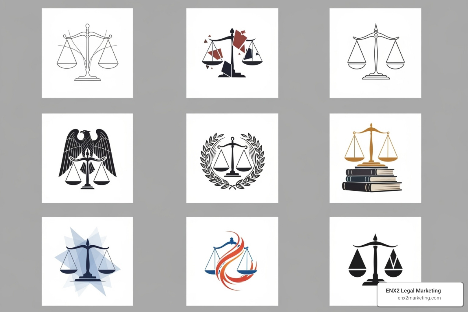
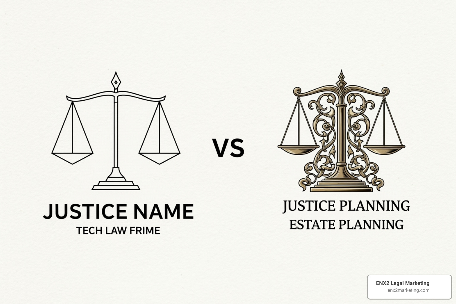
Minimalist designs have become popular, using clean lines and white space for a modern, sophisticated look that works well on digital platforms. Classic and vintage styles appeal to firms wanting to emphasize tradition, often featuring ornate details and heritage typography. Modern interpretations take a contemporary approach with geometric shapes or dynamic elements, suggesting a forward-thinking practice.
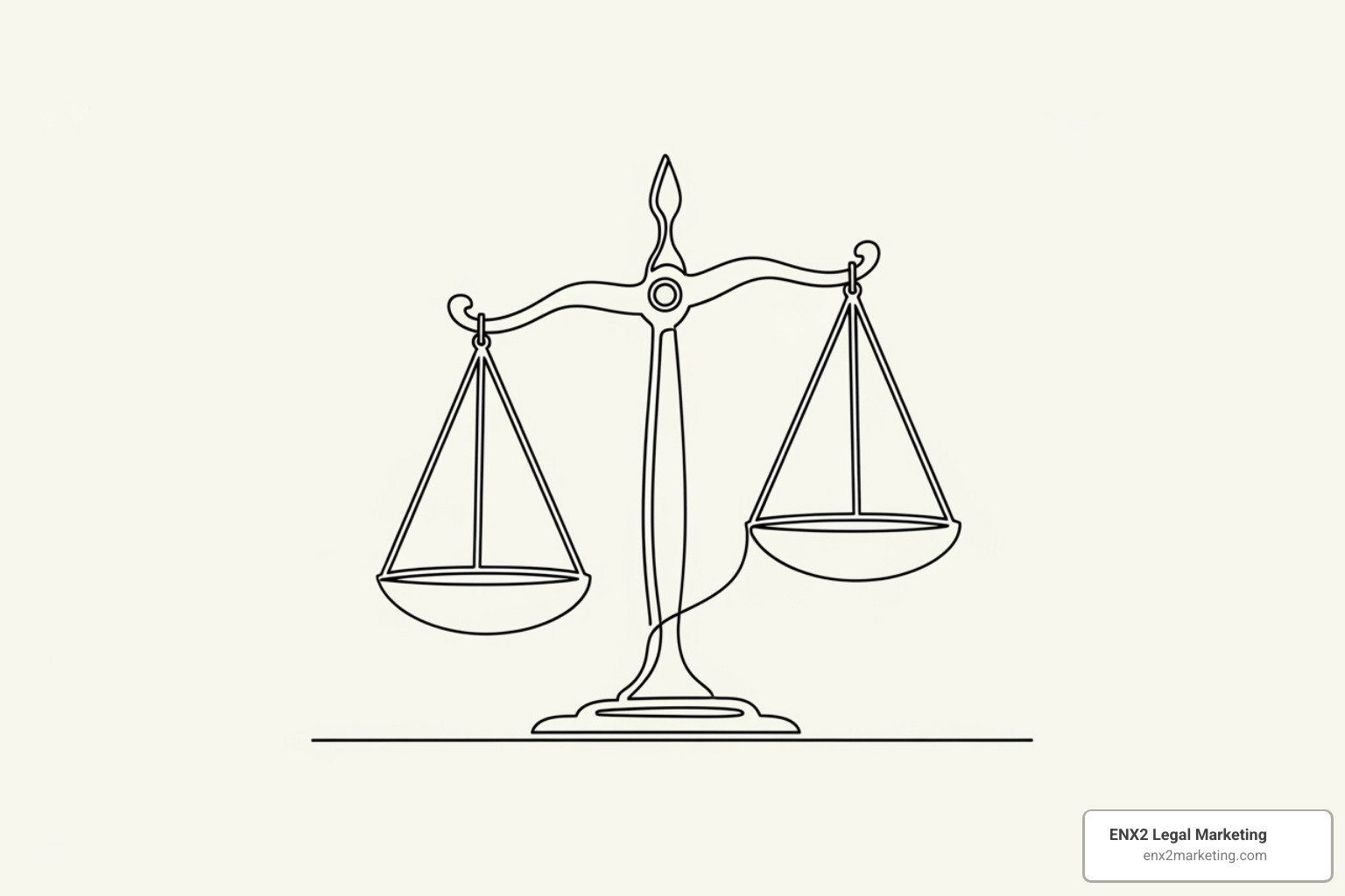
Emblem-style logos encase the scales within shields or crests, creating a strong mark that conveys authority and protection. Abstract designs push creative boundaries, using shapes and negative space to suggest balance without literally depicting scales. Other styles like line art offer simplicity, while 3D designs add depth for digital applications. The key is matching your choice to your firm’s personality and client base.
How to Create a Powerful Justice Scale Logo for Your Firm
Developing a powerful justice scale logo is a critical investment in your law firm’s future. In today’s crowded legal marketplace, a generic or poorly designed logo can hurt your credibility. Your logo creates that crucial first impression, communicating professionalism and trustworthiness in seconds. This is about strategic brand building that can impact your firm’s growth. We’ve seen how the right logo can transform a firm’s marketing, becoming an anchor for all branding efforts. Our insights on why your Brand Needs Best Logo Ever dive deeper into this topic. Creating an effective justice scale logo requires strategic thinking and professional design expertise.
Strategic Design: Choosing the Right Justice Scale Logo
Selecting the perfect justice scale logo requires understanding your unique position in the legal landscape. Your firm’s specialty should influence the design. A family law practice might incorporate softer elements, while a criminal defense firm might choose bolder styling. Understanding your target audience is equally crucial; a logo for individual clients will look different from one meant for corporate executives.
Color psychology also plays a role. Deep blues convey trust, while rich burgundies and forest greens suggest established authority. Gold adds prestige, and silver feels modern. We guide clients through the nuances of Using Color to Define Your Brand because it significantly impacts client perception.
Typography choices also matter. Traditional serif fonts convey heritage, while clean sans-serif fonts feel more contemporary. Most importantly, your justice scale logo should reflect your firm’s authentic personality—whether you’re aggressive litigators or compassionate advocates. Your logo should tell that story visually.
The Technical Details: Why Vector is Non-Negotiable
The file format of your justice scale logo is just as important as its design. This technical detail can make the difference between a professional look and an embarrassing one. Vector graphics are created using mathematical formulas, meaning they can be scaled to any size without losing quality. Whether on a tiny favicon or a large billboard, a vector logo looks crisp. Common formats are SVG, EPS, and AI files.
In contrast, raster images like JPEGs and PNGs are made of pixels. When you enlarge them, they become pixelated and blurry, which is not the impression you want to make. Vector’s versatility is essential for business cards, websites, signage, and promotional items. Professional designers understand this, but many firms learn it the hard way. For deeper technical insights, resources like the CSS-Tricks data URI documentation provide valuable information for web use.
| Application | Vector Performance | Raster Performance |
|---|---|---|
| Business cards | Crisp and professional | Good if high resolution |
| Website headers | Perfect scalability | Acceptable if optimized |
| Large signage | Flawless at any size | Pixelated and unusable |
| Social media | Clean at all sizes | Works if sized correctly |
| Promotional items | Easily adaptable | Often problematic |
From Concept to Reality: Partnering for the Perfect Logo
Creating your ideal justice scale logo requires a systematic approach that combines creative vision with strategic thinking. Partnering with experienced professionals who understand legal marketing is invaluable. The process begins with a comprehensive creative brief that digs deep into your firm’s personality, values, and objectives. Collaboration throughout the design process ensures the final result truly reflects your vision while benefiting from professional expertise.
Our experience with Graphic Design Services for Law Firms has taught us that successful legal branding requires balancing respect for tradition with the need to stand out. The technical execution is equally important. We ensure your logo is delivered in all necessary formats for seamless use.
Building a timeless brand requires thinking beyond trends to create something that will serve your firm for years. Your justice scale logo becomes the visual cornerstone of your marketing. For firms ready to invest, our specialized Law Firm Logo Design services combine creative excellence with a deep understanding of legal marketing to create a distinctive visual identity.

