Why Your Law Firm’s Visual Identity Matters
In the competitive legal landscape, a law symbol logo is more than decoration; it’s your firm’s first impression and a cornerstone of your brand identity. It’s the visual shorthand that tells your story, communicates your values, and sets you apart. Before a potential client reads a single word, your logo conveys professionalism and builds trust, offering a significant competitive advantage. In a digital-first world, where attention spans are short and choices are abundant, this initial visual connection is paramount. Your logo appears on your website, social media profiles, email signatures, and online directories, working tirelessly to establish credibility and recognition before you ever speak to a potential client.
Common legal symbols like the Scales of Justice (fairness), Gavel (authority), Pillars (strength), Books (knowledge), and Shield (protection) are instantly recognizable. However, with most consumers searching online for legal services, your logo must not only work across digital platforms but also stand out in a crowded marketplace. A generic or poorly designed logo can inadvertently signal that your firm is outdated or indistinguishable from others. The challenge is to balance traditional symbolism with modern design, creating a distinctive identity that honors legal tradition while resonating with your target clients.
I’m Nicole Farber, and with over 12 years leading ENX2 Legal Marketing, I’ve seen how a compelling law symbol logo can transform a firm’s market presence. My experience has shown that the right visual identity is crucial for client acquisition and building lasting brand recognition.

What This Guide Covers
This guide explores law symbol logo design. We’ll examine the meanings behind common law symbols, trace the evolution of legal logos from traditional to modern, and offer actionable insights for choosing a symbol that conveys professionalism and trust. We will also cover modern design trends and the key elements of a strong, memorable logo.
Decoding the Iconography: A Guide to the Classic Law Symbol Logo
This section explores the rich history and modern application of symbols in legal branding, helping you understand the language of law logos.
The Meaning Behind Traditional Legal Symbols
For centuries, certain symbols have been universally recognized as representations of law and justice. Understanding their meanings is crucial for crafting a powerful law symbol logo.

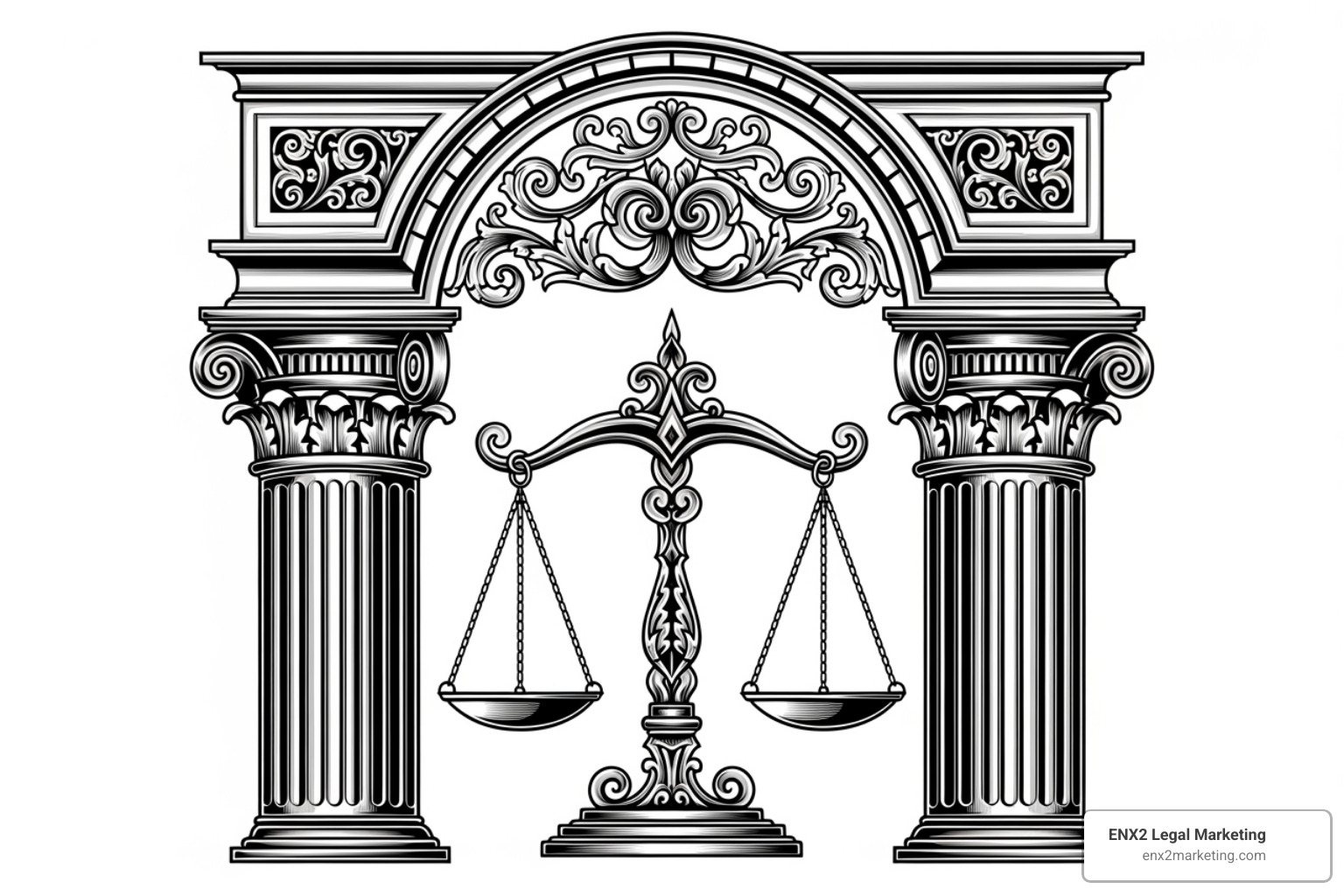
- Scales of Justice: The most iconic legal symbol, representing fairness, impartiality, and the weighing of evidence. The two balanced scales signify that both sides of a case will be considered without prejudice, a core tenet of the justice system.
- Gavel: A symbol of authority, order, and the finality of judicial decisions. Its sound brings order to the court and signifies the conclusion of proceedings, making it a powerful emblem of decisiveness and control.
- Pillars/Columns: Evoking classical architecture from ancient Greece and Rome, these signify strength, stability, and the enduring, foundational nature of the legal system. You can learn more about the symbolism of justice through various cultural representations, including those in official city symbols like those in Washington D.C..
- Lady Justice: Often blindfolded and holding scales and a sword, she embodies objectivity (the blindfold), fairness (the scales), and the power of reason and justice (the sword). She is a composite figure representing the moral force in judicial systems.
- Books/Scrolls: These represent knowledge, legal precedent, and the importance of written law, such as constitutions and statutes. They convey a sense of studiousness, expertise, and adherence to established legal doctrine.
- Shield: A symbol of protection and defense, suggesting the firm acts as a guardian, safeguarding clients’ rights and interests against legal challenges.
The Evolution from Literal to Abstract: Modernizing Your Law Symbol Logo
The traditionally conservative legal industry is shifting its approach to branding. Historically, law symbol logo designs were literal, featuring detailed gavels or scales. While recognizable, this approach can feel dated or generic in a modern digital landscape.

Many firms now accept modern, abstract representations for uniqueness and versatility. This evolution involves:
- Simplicity and Minimalism: Modern logos favor clean lines and strip away unnecessary elements to focus on a core message. This approach improves memorability and ensures the logo is clear and legible, even at small sizes on mobile devices.
- Abstract Imagery: Instead of literal depictions, abstract logos use shapes, lines, and negative space to evoke legal concepts, allowing for more creative and sophisticated designs that can set a firm apart from competitors.
- Modern Typography: While classic serif fonts convey tradition, many firms now use clean, sans-serif fonts to project a contemporary and accessible image. The right typography and color are crucial for defining your brand. We have extensively discussed Using Color to Define Your Brand.
Key Considerations for Your Firm’s Emblem
Designing a timeless emblem requires careful thought.
| Feature | Literal Symbols | Abstract Symbols |
|---|---|---|
| Pros | Instantly recognizable, clear industry ties | Unique, modern, can convey complex ideas subtly |
| Cons | Can be clichéd, less distinctive, potentially dated | May lack immediate clarity, requires more explanation |
- Rules and Regulations: Always check state bar guidelines on advertising and branding before finalizing a design. Each state has its own rules of professional conduct governing how lawyers can advertise their services. For example, some states have specific restrictions on using terms like “specialist” or “expert.” The American Bar Association’s Model Rules of Professional Conduct, particularly Rules 7.1 through 7.5, provide a foundation, but your local state bar’s rules are paramount.
- Trademarking: Protect your unique logo through trademark registration to safeguard your brand identity. This prevents other firms from using a similar mark that could confuse potential clients and dilute your brand’s value.
- Versatility and Scalability: A strong logo must be effective across all platforms, from a business card to a billboard. Vector graphics are essential for ensuring your logo looks sharp at any size. You can find versatile Law Icons designed for scalability.
- Memorability and Uniqueness: In a sea of similar imagery, your logo must be distinctive. Aim for a design that is simple, relevant, and memorable to stand out.
Crafting Your Firm’s Identity: From Concept to Creation
A powerful logo is the cornerstone of your firm’s brand. This section provides actionable steps for creating a symbol that resonates with clients and reflects your firm’s unique value.
Choosing the Right Symbol for Professionalism and Trust
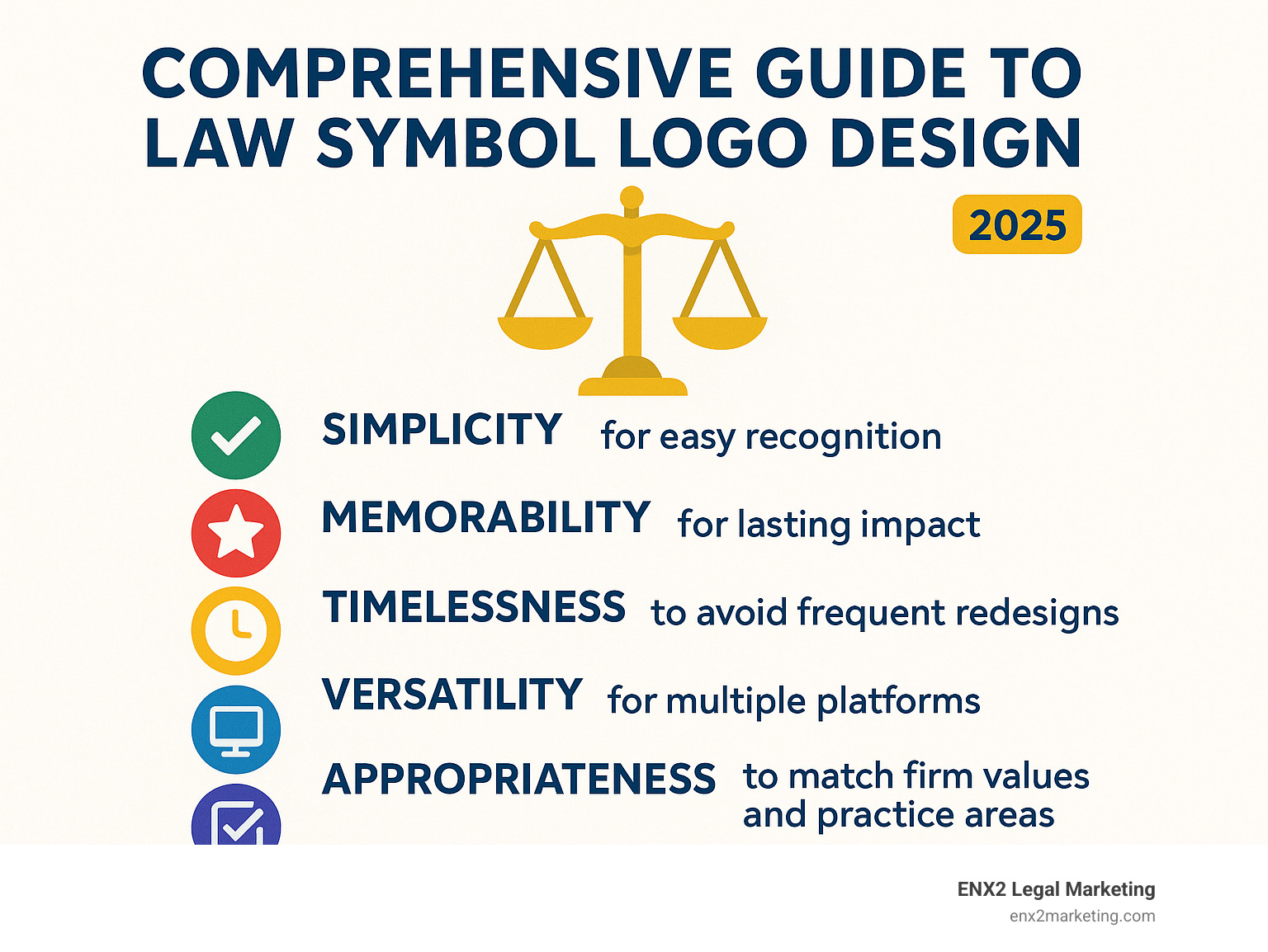
The perfect law symbol logo is a visual representation that tells your firm’s story at a glance. The design process should be guided by several key factors:

- Brand Identity and Values: Is your firm traditional and established or modern and disruptive? Your logo should reflect your personality and core values, such as integrity, compassion, or tenacious advocacy. A firm that prides itself on a long history might use a classic serif font and an established symbol, while a forward-thinking startup might opt for a bold, abstract mark.
- Target Audience: A logo designed for Fortune 500 corporate clients will differ significantly from one aimed at individuals seeking family law services. The former might require a look that is formal, strong, and sophisticated, while the latter might benefit from a logo that feels more approachable, supportive, and reassuring.
- Practice Area Focus: While general practices can use traditional symbols, specialized firms might benefit from custom designs that hint at their niche. An environmental law firm could incorporate a leaf or water droplet into its design. A tech law practice might use digital-inspired motifs like pixels or circuit patterns. A real estate law firm could use a key or a stylized roofline. This subtle visual cue can immediately communicate your expertise.
- Timeless Design: Avoid fleeting trends. The most successful logos stand the test of time by focusing on classic design principles of balance, proportion, and simplicity. The Art of Graphic Design emphasizes this balance between contemporary appeal and lasting relevance, ensuring your logo won’t look dated in a few years.
- Client Trust: Every element—from clean lines to thoughtful color choices—should be chosen to build trust and convey competence, reliability, and professionalism. Colors like blue and gray often evoke feelings of stability and dependability, while sharp, clean lines can suggest precision and focus. The goal is to create a visual that makes a potential client feel confident in your ability to handle their legal matters.
Examples of Effective Law Symbol Logos
The best law symbol logo designs find fresh ways to honor legal tradition while creating something memorable. Consider these popular approaches:
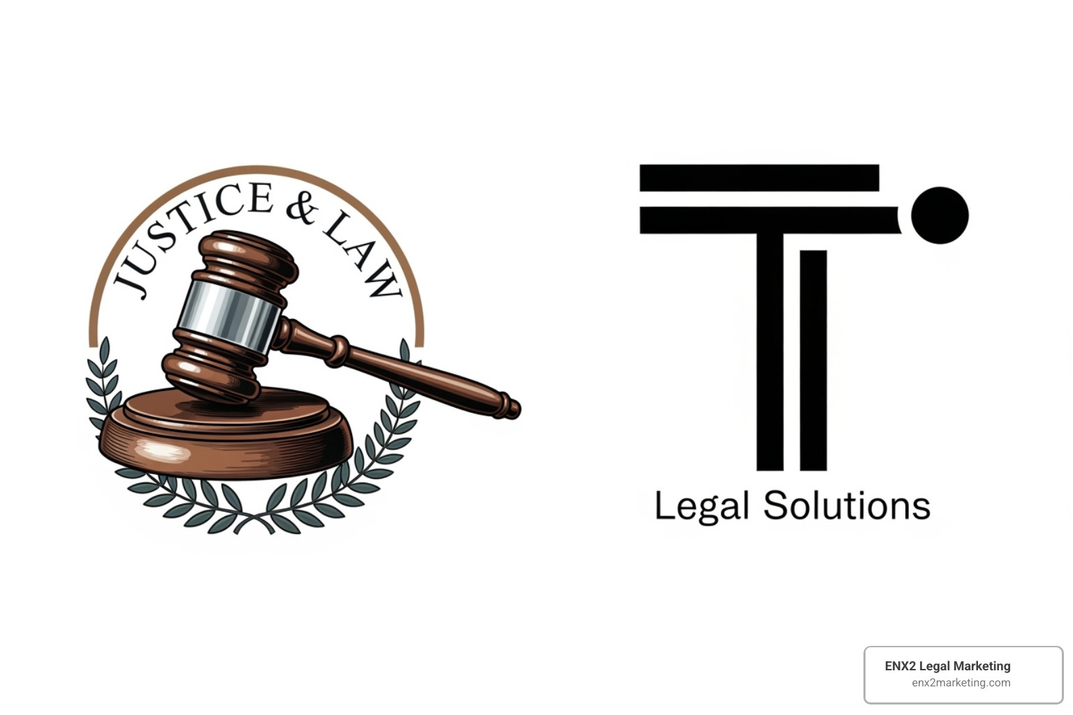
- Monogram Logos: Using the firm’s initials creates a sophisticated, personal, and professional symbol that is easy to remember and scales well. These are particularly effective for firms with long names or for building a brand around the partners’ identities.
- Abstract Logos: These use shapes, lines, and negative space to evoke concepts like justice or balance without literal depiction, making them unique and modern. An abstract mark can convey complex ideas like connection, growth, or protection in a subtle, elegant way.
- Geometric Shapes: Simple shapes can be powerful. Triangles suggest stability and strength, squares imply order and reliability, while interlocking circles can represent partnership, collaboration, or the attorney-client relationship.
- Combination Marks: Pairing a symbol (or mark) with the firm’s name (a wordmark) ensures brand recognition while adding visual interest. This is often the most versatile option, as the elements can be used together or separately depending on the context.
- Wordmarks: A distinctive, carefully chosen typeface can be just as effective as a symbol, conveying authority, innovation, or tradition. This approach places all the emphasis on the firm’s name, making it a strong choice for firms with a memorable name they want to emphasize.
The most successful design concepts often give familiar symbols an unexpected twist. A strong brand needs the best logo ever, one that makes people pause and look twice.
Partnering with Experts for a Lasting Impression
Your law symbol logo works around the clock to build your reputation. In a digital world where first impressions are formed in seconds, getting it right is essential. Creating a powerful logo requires more than design software; it demands a deep understanding of legal industry dynamics, client psychology, and strategic branding.
At ENX2 Legal Marketing, our data-driven branding approach is backed by over a decade of experience in the legal marketplace. We don’t just create pretty logos; we craft strategic visual identities that attract your ideal clients and support your business goals. Nicole Farber’s 12+ years of legal marketing expertise allows our team to translate your firm’s unique strengths into a compelling visual story.
Your firm deserves more than a generic template. Building credibility starts with an exceptional first impression. To create a powerful and professional brand identity, work with a team that understands the legal industry. Learn more about our expert Law Firm Logo Design services and find how the right visual identity can transform your firm’s market presence.


