Why Mobile-First Design is Critical for Law Firm Success
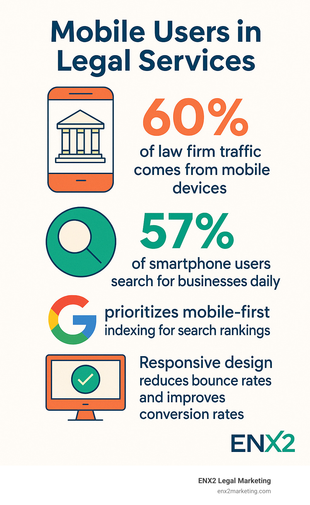
Responsive web design for law firms has become the cornerstone of effective legal marketing as mobile devices now generate over 60% of law firm website traffic. When potential clients search for legal services on their smartphones—which 57% of users do daily—a site that doesn’t adapt seamlessly to their screen creates an immediate barrier to conversion.
Quick Answer: Responsive Web Design for Law Firms
– Single codebase that adapts to all screen sizes automatically
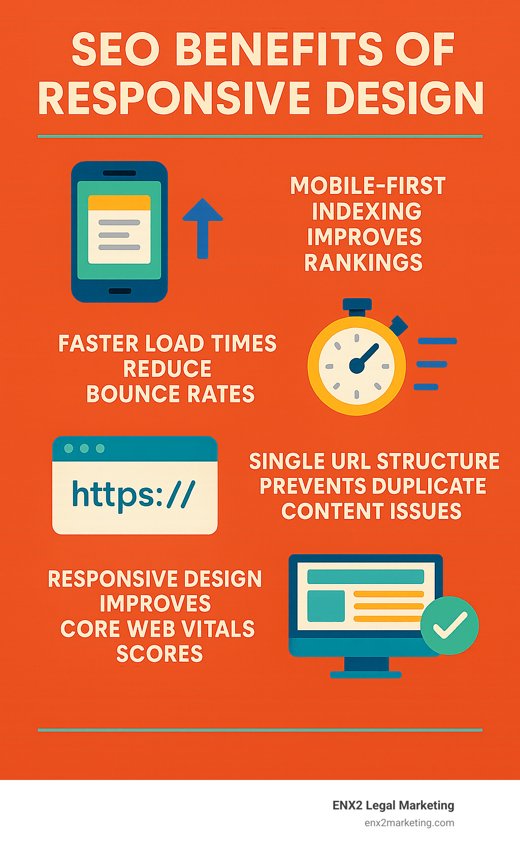
– Improved SEO rankings through Google’s mobile-first indexing
– Better user experience with faster load times (under 3 seconds)
– Higher conversion rates from mobile visitors
– Cost-effective maintenance compared to separate mobile sites
– Future-proof solution for new devices and screen sizes
The stakes are high: Google’s mobile-first indexing means your firm’s search visibility depends on mobile performance, while a 5-second delay in page load time increases bounce rates by 38%. Law firms without responsive design risk losing qualified leads to competitors who’ve acceptd mobile-first strategies.
Beyond technical requirements, responsive design builds credibility and trust—essential factors when potential clients evaluate legal representation during stressful situations. A professional, accessible mobile experience signals competence and attention to detail that clients expect from their attorneys.
I’m Nicole Farber, founder of ENX2 Legal Marketing, and I’ve spent 12 years helping law firms transform their digital presence through strategic responsive web design for law firms implementations. My experience shows that firms prioritizing mobile-first design consistently outperform competitors in both search rankings and lead generation.
Responsive web design for law firms vocabulary:
– best web design for law firm
– custom law firm web design
– law firm website builders
Responsive Web Design for Law Firms: The 2024 Playbook

Responsive web design for law firms uses a single codebase that adapts instantaneously to any screen size through flexible grids, media queries, and fluid layouts. This approach ensures your legal practice maintains consistent branding and functionality across desktop computers, tablets, and smartphones without requiring separate mobile sites.
The foundation of effective responsive web design relies on three core technical elements:
- Fluid Grid Systems: Using relative units (percentages) instead of fixed pixels allows content to scale proportionally across devices
- Flexible Images: Responsive images automatically resize and optimize for different screen resolutions and bandwidth constraints
- CSS Media Queries: These detect device characteristics and apply appropriate styling rules for optimal viewing experiences
Modern law firms must also incorporate emerging features that improve mobile user engagement. AI chatbots provide 24/7 client assistance, answering basic legal inquiries and capturing leads when your office is closed. Dark mode options reduce eye strain for users browsing legal content during evening hours, while video testimonials and explainer content perform exceptionally well on mobile devices.
Voice search optimization has become crucial as clients increasingly use Siri, Google Assistant, and Alexa to find legal services. Your responsive design should accommodate longer-tail, conversational keywords that mirror how people naturally speak when seeking legal help.
For comprehensive guidance on implementing these strategies, explore our best web design for law firm resource.
Responsive Web Design for Law Firms vs. Separate Mobile Sites
The debate between responsive design and separate mobile sites (m-dot versions) has been settled decisively in favor of responsive approaches. Here’s why maintaining separate mobile sites creates more problems than solutions:
| Factor | Responsive Design | Separate Mobile Site |
|---|---|---|
| Development Cost | Single build process | Double development work |
| Maintenance | One codebase to update | Two sites requiring synchronization |
| Content Parity | Identical content across devices | Risk of content gaps |
| SEO Value | Single URL preserves link equity | Diluted backlink authority |
| Google Ranking | Mobile-first indexing advantage | Potential duplicate content issues |
| Future Devices | Automatically supports new screens | Requires additional development |
With over 54% of global web traffic originating from mobile devices, responsive design eliminates the complexity of managing multiple versions while ensuring consistent user experiences. Google’s algorithms strongly favor responsive implementations because they provide unified content that’s easier to crawl and index.
The maintenance burden of separate mobile sites often leads to content discrepancies that confuse both users and search engines. We’ve seen law firms struggle with outdated mobile content while their desktop sites remained current, creating credibility issues with potential clients.
User Experience & Branding Benefits
Responsive web design for law firms maintains crucial trust signals that influence client decision-making. When attorney bios, testimonials, and professional imagery display consistently across devices, potential clients develop confidence in your firm’s attention to detail and technological competence.
Typography plays a critical role in mobile credibility. Responsive designs ensure legal content remains readable without zooming, using font sizes of at least 16px on mobile devices with adequate line spacing. This attention to readability demonstrates professionalism that clients associate with quality legal representation.
Dark mode options have emerged as a valuable branding differentiator, particularly for firms handling sensitive cases where clients may browse websites during evening hours. This feature reduces eye strain and positions your firm as technologically progressive.
The psychological impact of consistent branding cannot be overstated in legal marketing. When potential clients encounter the same visual identity, messaging, and functionality whether they’re researching on their phone during lunch or reviewing your services on their home computer, it reinforces your firm’s reliability and stability.
SEO & Performance Boosts
Google’s mobile-first indexing fundamentally changed how search engines evaluate websites. Your firm’s mobile performance now determines desktop rankings, making responsive design essential for search visibility. Law firms with mobile-optimized sites consistently outrank competitors with desktop-only designs.
Core Web Vitals metrics—loading speed, interactivity, and visual stability—heavily favor responsive implementations. Sites loading in under three seconds experience significantly lower bounce rates and higher engagement, directly impacting your firm’s lead generation potential.
Schema markup integration becomes more effective with responsive design because search engines can better understand your legal content structure. This leads to improved rich snippets displaying practice areas, attorney information, and client reviews directly in search results.
The consolidation of backlink equity to a single URL structure strengthens your domain authority compared to splitting link value between desktop and mobile versions. This unified approach amplifies the SEO value of every earned link and mention.
For detailed SEO optimization strategies, review our SEO for custom website guide.
Key Elements of a Mobile-Friendly, Responsive Law Firm Website

Successful responsive web design for law firms incorporates eleven essential elements that ensure optimal mobile user experiences:
- Hamburger Navigation Menu: Collapsible menu systems preserve screen real estate while maintaining easy access to practice areas and firm information
- Prominent Hero Call-to-Action: Above-the-fold contact buttons with tap-friendly sizing (minimum 44px) encourage immediate engagement
- Streamlined Contact Forms: Simplified forms with auto-advancing focus and floating labels reduce friction for mobile users
- Responsive Images: Properly sized images with alt text and lazy loading improve performance without sacrificing visual impact
- Touch-Friendly Typography: Font sizes ≥16px with adequate contrast ratios ensure readability across lighting conditions
- Fast Loading Speed: Optimized assets and compressed images achieve sub-three-second load times
- SSL Certificate: Security indicators build trust essential for legal service inquiries
- Clear Privacy Policy: Accessible privacy information addresses client confidentiality concerns
- Legal Disclaimers: Properly positioned disclaimers protect your firm while maintaining user experience
- Accessibility Features: WCAG compliance ensures your services remain available to all potential clients
- Integrated Maps and Directions: One-click navigation to your office locations facilitates in-person consultations
These elements work synergistically to create mobile experiences that convert visitors into clients. The key lies in balancing comprehensive information with streamlined presentation that works within mobile screen constraints.
Testing & Maintaining Responsive Web Design for Law Firms
Ongoing testing ensures your responsive design continues performing optimally as technology evolves. We recommend a multi-tool approach combining automated testing with real-device validation:
Primary Testing Tools:
– Google Mobile-Friendly Test Tool provides immediate feedback on mobile optimization
– MobiReady offers comprehensive mobile readiness scoring
– PageSpeed Insights analyzes Core Web Vitals performance
– Real device testing across iOS and Android platforms reveals user experience issues automated tools miss
Monthly maintenance schedules should include security patches, CMS updates, and performance audits. Content management systems require regular updates to maintain security and functionality, while performance optimization becomes an ongoing process as your firm adds new content and features.
Browser compatibility testing remains crucial as mobile browsers frequently update with new features and rendering changes. We’ve found that quarterly cross-browser testing catches issues before they impact client experiences.
For comprehensive mobile optimization strategies, explore our don’t neglect mobile website resource.
Next Steps: Launch Your Mobile-First Firm Website Today

The time for responsive web design for law firms is now—not next quarter, not next year. Every day your firm operates with a non-responsive website, you’re losing potential clients to competitors who’ve acceptd mobile-first strategies.
I’ve been helping law firms steer digital changes for over a decade at ENX2 Legal Marketing, and I can tell you that the firms taking action today are the ones thriving tomorrow. We’ve seen practices double their mobile leads within months of launching responsive designs.
Project timelines typically run 6-12 weeks, depending on your site’s complexity and content needs. We start by diving deep into your current mobile performance—and trust me, the results often surprise even tech-savvy attorneys. Most firms find they’re losing 40-50% of potential mobile visitors due to poor user experiences.
Our budget planning process ensures you understand exactly what you’re investing in and why. While responsive redesigns require upfront investment, our clients consistently see measurable returns through improved search rankings and conversion rates. The numbers don’t lie: firms with mobile-optimized sites generate significantly more qualified leads.
Free audit offer: We’re providing complimentary mobile performance audits for qualifying law firms. This isn’t a sales pitch disguised as an analysis—it’s a genuine assessment of your Core Web Vitals, mobile usability, and specific optimization opportunities. You’ll receive actionable recommendations regardless of whether you work with us.
The beauty of modern responsive design lies in continuous improvement. Your website becomes a living asset that evolves with changing user expectations and search engine requirements. Our analytics dashboards provide ongoing insights into mobile user behavior, enabling data-driven optimizations that maximize your return on investment.
Think of it this way: your mobile presence is often a potential client’s first impression of your legal expertise. If your site doesn’t work seamlessly on their phone, what does that say about your attention to detail in their case?
Ready to transform your firm’s mobile presence? Let’s discuss your responsive design project and explore how mobile-first strategies can accelerate your practice growth. For more information about our comprehensive approach to legal marketing, visit our legal marketing firm page.
The firms that accept responsive web design for law firms today will dominate their markets tomorrow. Don’t let outdated technology hold your practice back from reaching its full potential.